Tuesday, 29 March 2011

Development of Magazine Advert

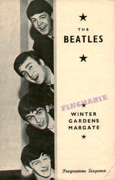
The magazine advert again was created on Photoshop, despite the program being used being excellent i found hard to create the advert. I was torn between wanting to create somethin completely new and vibrant to do with the new video or to stick with the theme and stay true to the band, the music and the times. I trialed the new vibrant look with a mix of the general old style which was posters like these for example:


When I tried to recreate this sort of look, with a modern twist, in colour and with some form of contemporary style i could only come up with these:


I never really felt that these two attempts were good enough. They had the simplicity and the colour but the one on the left was too empty and the one on the right was too much like a puzzle. I do however like the effects on the largest picture and the top right block in the right hand advert. These effects are called "" and "" and i applied them by selecting the layer with the desired image on and then going to the effects menu and trialing all of them out till the desired ones were found.


After these two attempts, i decided that maybe it was time to try and really imitate the styleand simplicity of those advertisements and posters previously shown. I started a new document on Photoshop left the background blank and first of all put the writing and album cover on. Once these were in place at the bottom and the title at the top there was a strip to fill. I saw from the research i did that the heads of the band were used alot in their posters, so i decided to have the same with the characters from my video. I did this but it still looked empty so the framing of them in the blue oval filled the space and also gave the figures a nice platform to sit on.


The characters profiles were taken from stills of the music video screen shotted and placed into Photoshop where they were cut down with the eraser tool, turned black and white and given a drop shadow to stand out that little bit more. I feel that the final design for my Magzine advert is definately the most retro of the three products i created, it is heavily influenced by the style of actual Beatles posters and as a result has a big link with the band and with the times. I think it is good to see something different, and this advert is different because it is a style that has been lost, most posters or magazine adverts nowadays are much busier but i think it is quite nice to have gone back to the simpler times.

Development of Digipack


For the digipack i used Photoshop to create it as it has the facilities to allow to create a professional looking product.I had to create each individual panel and and then piece them together as a final jpeg, so i had two 3 piece panels in the end.
The whole creation process is down to this toolbar. This toolbar has all of the tools i needed to, insert, cut, add effects, add font, change colour and edit the items that i put on the digipack.
For the front cover i had a clear image of what
i wanted it to look like, i had selected a picture that i wanted to put on the front the hardest part was deciding how to make my idea a reality. I imported
the image and added the font which for the moment was the original Beatles font so it looked like this.


So from this i was thinking of going in the direction of the Reservoir Dogs film posters, wi
th the suits being all black and the skin tones being the same as the background. To do this i needed to delete the background and just isolate the person then do the same to the skin tones and shirt so i would be left with the suit and hair. I tried using the magic wand to isolate just the man and then delete the background but that didn't work. So i then tried the magic rubber, this deletes sections of the same colour and this worked to a certain extent but then it started to delete fragments of the suit which wasn't the desired effect. The final option then was for me to painstakingly go round the image with the normal rubber tool and zooming in really really close . This was how that attempt turned out. As you can see
my hand wasn't steady enough and it didnt come out very well so i decided to scrap that idea and go down a different route. I also changed the font for this particular style, because although not as iconic as the original Beatles font, i felt that it matched the desired look better.


So after that idea didn't work out i tried put
ting many different many different effects, i looked at it sketchy, painted, lighted up, darkened, strobe lighted and many more but they either distorted the image so much it was unclear what it was or just didn't look right so in the end i decided to add a black and white effect to it. I felt that this would give it a slightly older look and also add a harshness attitude to the cover, emphasise the lonelyness of the character. I decided to go back to the original font with this design because i felt it fitted it better than the one i had changed it to, although i did change the colour and add a drop shadow, i did this to . The cover ended up looking lik this and im happy with the way it looks.


The other panels were much easier to design and here is the thought and production process behind those panels.


Target Audience

When making my products, the music video, digipack and Magazine advertisement, i had tokeep in mind the people that it was aimed at. Who were my target audience?
Well with the music of The Beatles spanning many genres it is difficult to pinpoint one particular group of people. So with The Beatles being mainly recognised as a traditional rock band i thought that it would be a good idea to try and appeal to that market, but also try and add a modern innfluence where i could. In the video there are many more modern influences in the way it is filmed than would be in a traditional rock music video.
With the way that there was no live performance but mainly a narrative and occasionally an individual performer singing or playing an instrument; some of the effects on certain shots (the cymbals/meeting sequence) are styled more like a pop or techno music video than a traditional rock video.
We can see how other traditional rock bands have taken other genres video styles into their own with the ACDC song "Rock n roll train" it has the same sort of effect as my cymbal/meeting sequence does.

So with the video i tried to bring it more up to times and to also incorporate many different genres as The Beatles did with their music. With the rest of my products though o odecided to try and stick to the times when The Beatles were in their prime, so i created a more retro looking magazine advertisement and the digipack i feel is somewhere imbetween modern style and the older look.

Location Shots

I think that during my shoot there were a maximum of 5 different locations; the bridge, the park, alleyway, garages and the streets. The filming done onthe streets was usually done on the way to the other locations so they weren't specifically chosen, Below are some still from the video that show the locations in the final production.

Artist Request

I had to send an email to whoever currently owns the rights to the song asking for permission to use the song and letting them know it is for my A2 coursework and not for financial gain.

Risk Assessment

I didnt think i really needed a risk assessment because well i didnt think i was doing anything particularly risky in my video. It's walking, singing, walking, swinging, walking some more if you break it down to its bare essentials. I did all of the filming unless i was singing in which case it was on a tripod in a stationary position. Probably the most potentially dangerous shot i got was the P.O.V shots from on the swing but i came up with a solution and that was to not actually be on the swing but to move the camera as if i was swinging, this meant that i was standing and moving the camera whilst holding it steady with both my hands; the only real risk avoided there.

Editing

Editing is a vital process when making a music video, if not done properly it can make the video uninteresting to watch, disturb the flow of the video and even become distracting when watching the video. If there are lots of fast cuts and extreme effects in a music video for a very slow song then it won't work the video would be unsuited for that song and vice versa. So as my song choice has quite an unusual varying pace, i found it difficult to find the right balance in the editing process when it came to the tempo of the cuts and the video. During the editing process i used two programs, Adobe Premiere Pro and Adobe After Effects.

Premiere Pro

This is the program used to assemble all of the footage together and the transitions and some of the effects were added here. With this tool bar i was able to manipulate the footage, cut it down and stretch it for example.


The most commonly used tool i used was the cut tool, every piece of footage i filmed was always much longer than was needed. This was to ensure that i had enough, because if you have to much you can always cut it down but if you don't have enough footage then there is little you can do without effecting the quality of the footage.


As you can see from the picture below the timeline for the video is constructed from all different clips of varying lengths and some of the are different colours at the top, this means that they have had an effect put on them. The effects could be edit transitions, like at the end of the video there is like a montage of the times the characters spend together so i added some of the edits rather than having a simple cut i added fade outs and wash outs to bring a bit of variation to the edits. I added these transitions by going to the effects tool bar at the side and then selecting video transitions and from there picking the effects and dragging it onto the clips i wanted it to effect and i could change when the effect came in and when it ended on the clip.


Premiere Pro is the main place where all of the clips are assembled but not all of the clips have to be put straight on there and effected on premiere pro; this is where the other program i used comes in After effects.


After Effects

After Effects is where i edited all of my green screen footage. It has the facilities that Premiere pro doesn't so i had to use this one. It works on much the same basis but its function is to add effects to footage not to put the footage all together like the Premiere Pro.

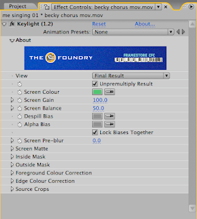
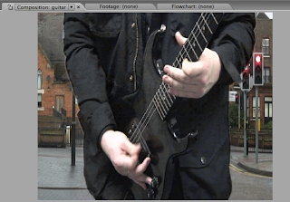
Here is a picture of the original footage i took from in front of the green screen, we can see Paul playing the guitar in front of the green screen, i need to remove the green and insert the footage of the fast moving cars behind him. So to do this i go to the effects list and select keying then keylight 1.2 and another window pops up where i have to make sure that it know what colour i want it to remove which is green. Once the green is removed i have a cut out or Paul and a empty background ready for me to insert the other footage.

To do this i import the footage of the cars and then drag it down onto the timeline making sure that it is below the the footage of paul playing the guitar on the list so that the footage is shown behind the cut out guitarist footage and as a result providing a background where the green screen used to be. It then looks like this and is ready to be exported ad imported onto Premiere Pro.


Cloning

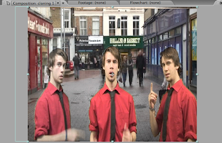
Cloning was another effect that i used After Effects to create. Cloning is when there is more than one of the same character one particular place. I used this effect for one specific line in the song "one and one and one is three", as the singer says the line two more of him walk in shot. It gave more emphasis to the line and is something interesting to watch.


The important thing to know when ur cloning is to not have the characters interacting with one another because that would complicate things immensley. If they were to hug or high five or come into contact with one another if not done perfectley then this would look really bad and ruin the illusion u have created with the effect.


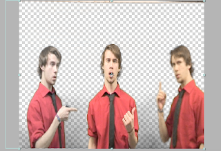
So i filmed three different sets of footage infront of the green screen, with me in the different places, one centre screen and then two entering from either side of the screen to say their line. Once this footage was captured it became a matter of using the keylight effect and removing the green screen from each of the clips as i had done before with the guitar sequence and then layering and positioning them on the timeline so that the charaters come in at the correct time.