Saturday, 2 April 2011

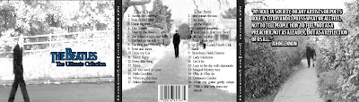
Final Digipack
Friday, 1 April 2011
Evaluation Question 1
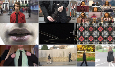
This first still is from one of the singers parts, conventionally the live action sequence. You can see from the first still that this is just the singer, no hint of a band, instead he’s placed in front of a town scene. This is the same all the way through the video, no complete band shot all together just the singer and as you can see form the second still it’s the same for the instrumental solos. This goes against the conventions of a generic rock music video where we would see a band performing to a live audience, this is replaced in my video with the performers being shown separately as this is the general theme of the video (Being individual, on your own). The performances echoes the narrative of the video, maybe to echo the narrative more at the end when the characters come together we should have seen the whole band together as well.

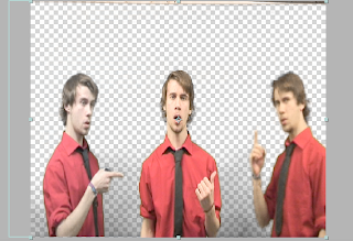
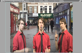
This still shows many different people all together singing the chorus, again this was filmed with all of the performers singular and then I edited them together on Adobe After Effects to bring them all together and as they are singing the chorus line “Come together” it is a good example of relating the video to the lyrics. I tried to get a mix of people to get involved because having a diverse mix of people I felt would reinforce the point behind the shot.
 This is a close up of my mouth saying the “Shoot me” line. The purpose of this shot is to add a little bit of diversity into the video, I felt that if the whole person was seen singing this line with it being such a small, quick line it would lose emphasis so with this framing I feel that it creates emphasis on the line. The style of this shot leans more to indie style music videos (which is the music I listen to so is probably where I got the influence from) than that of a traditional rock video; so in that sense I’ve deviated from conventions of a rock video and taken a style from a different genre of music.
 This shot, is very stylized I feel and I thin isn’t something that you would see in a traditional rock music video. Obviously the instrument in shot would be in a rock video but not in this way. I think that if it was it would be as it was without the effect, but the way I have the effected the hi-hat is more conventional of a pop video. The effect really adds a lot to what I think would be quite a plain shot and I like the diversity that this style of shot brings to my video overall.
 This still is taken from the beginning of the music video, where we don’t know the character, so the framing of the shot allows us to see just what he’s doing but not who he is, which creates an air of mystery about the character, makes him an enigma. With traditional rock music videos mainly consisting of a live performance having a narrative straight from the beginning of the video wouldn’t be something normally seen. Again I think I would have to say that despite having a traditional rock bands song I have deviated into modern rock and indie music videos style.
This shot is key in the narrative as it is the moment the two characters meet and “come together” like the songs title and chorus line say. The framing of this shot allows us to see both the characters coming from opposite directions and meeting in the middle . We see only them in the shot which is important as there is no other distractions and we can focus on the moment they meet. This is a turning point in the narrative which is needed to give the video that context.
 This still is a split screen from near the end of the video, where it is like a montage of their moments together but this split screen is like a memory of when they were alone, but also a subconsciously towards each other. This type of effect is used a lot in modern music video’s and is quite a basic but effective tool and id say is another way I have gone against the traditional rock music video conventions.
 Overall then I think I have challenged the conventions of a traditional rock video with my production and have been influenced by more modern rock and indie music videos. With the complete lack of a live performance is where I have stepped away from traditional rock videos the most and if anything have taken a step in the direction of pop music which I don’t think is necessarily a wrong thing to do because The Beatles covered many genres of music during their time and although being most commonly tagged as a traditional rock band did have other dimensions to their music. So by me dipping into other genres of music for influence it makes also gives my video that other dimension that The Beatles had in their music.
Evaluation Question 3
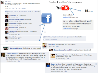
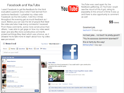
Firstly i tried to get as much audience feedback as i could possibly get, there was a school screening, i uploaded the video onto Youtube and Facebook and my blog, i showed family, the AS Media classes watched the videos andgave feedback. So from all of that i felt that i had then had enough audience feedback to analyse. The screening and the AS media feedback was given via a questionnaire, this consisted of 8 questions and rated 1 to 4, this gave me some quantitative data to analyse:How steady were the shots?
- How well framed were the shots?
- How varied were the shots?
- Was the choice of location appropriate?
- Was the lighting appropriate?
- How clear was the meaning?
- Was there appropriate use of special effects?
- Was there appropriate editing of sound and image, did the film make sense?
 This graph shows that 45% of viewers rated the steadiness of the shots 3 and 31% a 4. I think this shows that i managed to hold the shots steady and I'm happ y with this feedback because i only used a tripod for the perform ance parts with the singer and guitarist and when i did the down town filming, the rest was hand held.
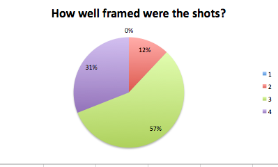 This graph shows another positive resp onse with 57% of viewers rating the framing a 3, only 12% a 2 and no one rated it a 1. This i feel is quite a good response because i think that the framing was quite good as well. I didn't have shots where the characters head was out of shot, or their are important pieces (hand gestures or objects) slightly out of screen.
This is graph shows a very positive response with 45% rating the variety of shots the highest score. I am really happy with this result because i did feel that although what was in the shots were along the same lines that i managed to keep the interest and the flow with the variance in shots. This graph shows that it was recognised and appreciated.
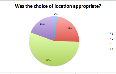 With over half the ratings being a 3 i am happy with this feedback. I am a little disappointed with 23% ratings of 2 and the 2% of 1's. I don't know what wa s wrong with the locations and it would have been nice to have got some comments suggesting alternative locations, but unfortunately none were given. I think that for what the video content is, the locations used were suitable; with them always on the move it could be seen as if the two characters were subconsciously looking for each other.
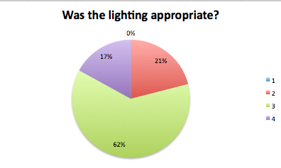 With this graph i am confused, I got 62% of people saying the li ghting was a 3 which i interpret as being good but then i got a few comments (which i agree with) saying that shots are too bright. I do think that shots are too bright in a few circumstances in my video so to have the higher rating percentage i think is slightly odd, not that i'm complaining. Its good to know people thought the lighting on the whole was good but i think it is something i would improve on given another chance.
 Again a high percentage of 3's, i didn't use a lot of special effects in my video, the green screen things for the vocals, the cloning and the odd transitional effect. O ther than those i don't feel i overloaded the video with special effects so i agree with this feedback.
 This graph is a basic overview of the general opinion of people on all aspects of the video. I am pleased to see the higher percentage of people had a positive view on the entirity of the video but a little bit dissapointed on the quite so high percentage of 2 votes.
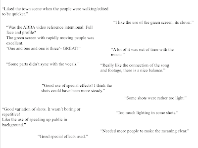
So overall from all of the feedback i have collected i think that my video got a generally good reception. If i was given the second chance given the feedback i received this time round i would make sure that i definately worked alot more on my planning so that i had a concrete path to follow. I think this would give me a stronger base to then make sure that the narrative is clearer, i would be getting the filming done quicker and could then concentrate on the editing process and then things like the cuts and syncing would be spot on. I think i would also maybe do a more studio based video because from the comments, the effects are what people like and i also wouldn't really have the lighting problem with the shots being too bright because i would have control over the lighting.
Evaluation Question 4
Tuesday, 29 March 2011
Development of Magazine Advert


I never really felt that these two attempts were good enough. They had the simplicity and the colour but the one on the left was too empty and the one on the right was too much like a puzzle. I do however like the effects on the largest picture and the top right block in the right hand advert. These effects are called "" and "" and i applied them by selecting the layer with the desired image on and then going to the effects menu and trialing all of them out till the desired ones were found.
After these two attempts, i decided that maybe it was time to try and really imitate the styleand simplicity of those advertisements and posters previously shown. I started a new document on Photoshop left the background blank and first of all put the writing and album cover on. Once these were in place at the bottom and the title at the top there was a strip to fill. I saw from the research i did that the heads of the band were used alot in their posters, so i decided to have the same with the characters from my video. I did this but it still looked empty so the framing of them in the blue oval filled the space and also gave the figures a nice platform to sit on.
The characters profiles were taken from stills of the music video screen shotted and placed into Photoshop where they were cut down with the eraser tool, turned black and white and given a drop shadow to stand out that little bit more. I feel that the final design for my Magzine advert is definately the most retro of the three products i created, it is heavily influenced by the style of actual Beatles posters and as a result has a big link with the band and with the times. I think it is good to see something different, and this advert is different because it is a style that has been lost, most posters or magazine adverts nowadays are much busier but i think it is quite nice to have gone back to the simpler times.
Development of Digipack
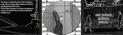
 For the digipack i used Photoshop to create it as it has the facilities to allow to create a professional looking product.I had to create each individual panel and and then piece them together as a final jpeg, so i had two 3 piece panels in the end.


Target Audience
Location Shots


Artist Request

Risk Assessment
Editing
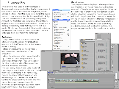
Premiere Pro
This is the program used to assemble all of the footage together and the transitions and some of the effects were added here. With this tool bar i was able to manipulate the footage, cut it down and stretch it for example.


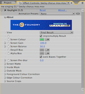
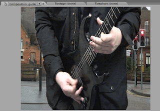
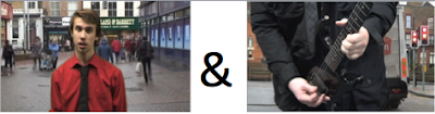
 Here is a picture of the original footage i took from in front of the green screen, we can see Paul playing the guitar in front of the green screen, i need to remove the green and insert the footage of the fast moving cars behind him. So to do this i go to the effects list and select keying then keylight 1.2 and another window pops up where i have to make sure that it know what colour i want it to remove which is green. Once the green is removed i have a cut out or Paul and a empty background ready for me to insert the other footage.