


I never really felt that these two attempts were good enough. They had the simplicity and the colour but the one on the left was too empty and the one on the right was too much like a puzzle. I do however like the effects on the largest picture and the top right block in the right hand advert. These effects are called "" and "" and i applied them by selecting the layer with the desired image on and then going to the effects menu and trialing all of them out till the desired ones were found.
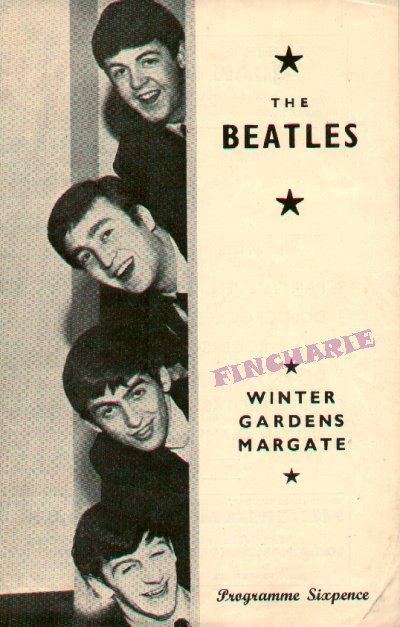
After these two attempts, i decided that maybe it was time to try and really imitate the styleand simplicity of those advertisements and posters previously shown. I started a new document on Photoshop left the background blank and first of all put the writing and album cover on. Once these were in place at the bottom and the title at the top there was a strip to fill. I saw from the research i did that the heads of the band were used alot in their posters, so i decided to have the same with the characters from my video. I did this but it still looked empty so the framing of them in the blue oval filled the space and also gave the figures a nice platform to sit on.
The characters profiles were taken from stills of the music video screen shotted and placed into Photoshop where they were cut down with the eraser tool, turned black and white and given a drop shadow to stand out that little bit more. I feel that the final design for my Magzine advert is definately the most retro of the three products i created, it is heavily influenced by the style of actual Beatles posters and as a result has a big link with the band and with the times. I think it is good to see something different, and this advert is different because it is a style that has been lost, most posters or magazine adverts nowadays are much busier but i think it is quite nice to have gone back to the simpler times.
No comments:
Post a Comment